
This is an almost full-proof method I figured out to create different colorways for a pattern. The new colorways look very harmonious and it’s easy to change the mood, look & feel of the pattern with this method. It’s also a neat trick to try if you’ve got a pattern where the colors just don’t seem to go together for some reason.
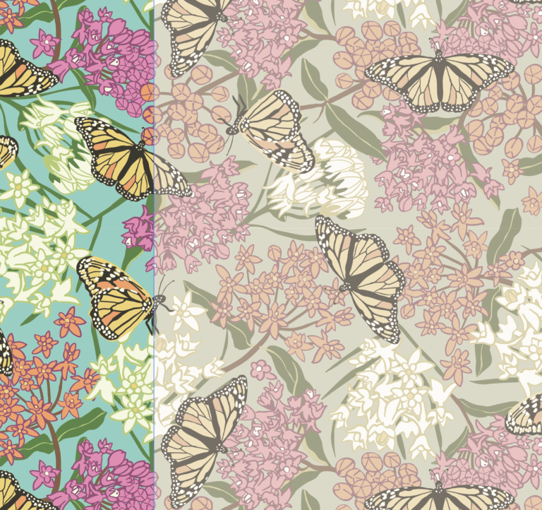
This pattern started out with clear vibrant tones but I wanted a second colorway that was much more muted and vintage looking in comparison to the original.
I created the pattern in Adobe Illustrator but use Photoshop’s color correction tools, adjustment layers and blending modes to find new colorways that are harmonious and beautiful.
It can be a fun process and an easy way to discover new color combinations you hadn’t even thought of. The before and after of this example can be seen above in the featured image.
I’ve created this tutorial in short video clips so you can see each step, one at a time. It makes it easier to replay that step in case you need to see it again.
Using the Recolor Artwork tool, create a new color palette of your current pattern and add it to the Swatches Panel
Since you are working with your pattern swatch to change its colors, you might want to create a new document and copy the swatch there instead of changing the original swatch of your original design. It’s also best to have nothing else visible on your artboard except the pattern swatch you’re changing.
Add the colors of the pattern swatch to your Swatches Panel. You can do this using the Recolor Art tool (shown below) or by selecting your pattern swatch and clicking the “New Color Group” button in the Swatches Panel.
Next, make a swatch of each color on your artboard by drawing a square, selecting it and select one of the colors in your Swatches Panel until all the colors have been chosen.
Copy the pattern swatch and colored tiles and paste into a Photoshop document
Select both the pattern swatch and all the colored tiles. Copy and paste them into a Photoshop document as pixels. If the new image comes into Photoshop as a CMYK color mode, change it to RGB. (Not required but helps make more options available).
Use Adjustment Layers to change the color of your pattern swatch
To proceed, add a new Adjustment Layer to change the colors of your pattern swatch. Adjustment Layers are non-destructive so the changes you make can be tweaked and deleted without ever touching the original image.
The button can be found at the bottom of Photoshop’s Layers Panel. There are many options there and you can add more than one Adjustment Layer, helping you to completely change the colors of an image without changing the actual image itself.
I want to create a new colorway that looks vintage and aged, so the colors need to appear faded as though they’ve been changed by the sun and time.
To do that I will play around with the following Adjustment Layers: Levels, Photo Filter (sepia), Brightness/Contrast, Hue/Saturation, Black & White.
First I’ll add a Levels Adjustment Layer to make the pattern appear faded. I lower the black tones (first slider) and the midtones (middle slider).
Close the panel and you can see a new Adjustment Layer in your Layers Panel. As long as that Adjustment Layer is located above the image in the Layers Panel, the image shown on your canvas will be effected by that adjustment.
Add a Photo Filter Adjustment Layer to add a sepia tone
In my example I add a sepia tone to the pattern swatch to give a vintage look. To add your own photo filter you can choose a preset from the drop down menu next to “Filter.” Or you can use your own custom color. You can also change how much impact the filter has on your image using the slider.
There are many MANY different ways to change the actual colors of your pattern swatch. I’ll show you more later. You can decide to use all or just some of these Adjustment Layers.
Add a Brightness/Contrast Adjustment Layer
Next I add a Brightness/Contrast Adjustment Layer. I don’t see a big change; this might be because the Levels Adjustment Layer already did the trick. But I’ll leave it and play around with it when I get all my Adjustment Layers in place.
Add a Hue/Saturation Adjustment Layer
Since the new colorway is going to be faded and vintage looking, I need to lower the saturation of the colors. I can use several types of Adjustment Layers to accomplish this: Vibrance…, Hue/Saturation or a Black & White Adjustment Layers.
In this example I’m using a Hue/Saturation Adjustment Layer. Inside this Adjustment Layer you can completely change the color of your pattern swatch and I will show you how later.
Add a Black & White Adjustment Layer
I just added a Hue/Saturation Adjustment Layer to change the saturation of the colors in my pattern swatch. But I want to also add a Black & White Adjustment Layer to see which one I like best. I probably won’t need both adjustments.
The default settings of the Black & White layer Adjustment Layer makes your image a grayscale image. Don’t fret.
Add the Adjustment Layer then lower the opacity or fill inside the Layer Panel.
You can do that with any/all of the adjustment layers to determine how much of an impact you want them to have on your new colorway. Just lower the opacity or fill to have less of an impact. Adding adjustment layers allow you to adjust, tweak and change as you go (non-destructive method).
There is a lot more you can do with the Black & White Adjustment Layer other than create a grayscale image. You can change the saturation of a specific color range using the presets and/or sliders.
(Not shown in the video clip) To change the saturation of a specific color range, add a new B&W Adjustment Layer then lower it’s opacity or fill in the Layers Panel. Then adjust the saturation of a specific color range you using sliders and/or presets.
Tweak the Colors of Your Pattern Swatch
At this point I want to start playing around with colors in my new colorway by tweaking the various Adjustment Layers. To do this I can turn the visibility an Adjustment Layer on or off by toggling the eyeball to the left of that layer.
I can change how much of an impact an Adjustment Layer has on my pattern swatch by changing the opacity or fill at the top of the Layers Panel.
I can even go back into the Adjustment Layer and change it’s settings by double-clicking on the adjustment’s icon (to the right of the eyeball).