
So I’m back on the next lesson of Liz Kohler Brown’s series on finding your artistic style. This is a course from her online community called The Studio.
In this lesson we’re supposed to start looking at some of our design heroes and discover what it is we like about their work. What is it that draws us in to want to take a closer look and then see more things designed and created by them?
For me, I feel like I’m all over the place. First, there are so many illustrators and artists that I am drawn to. Consequently, this exercise is taking me a lot of time to try and narrow it down and really figure out WHO I am most attracted to and WHY.
Again, when I look at their work (I’ll share that in a minute), it’s difficult to see a thread that joins all of them. Some of them seem actually opposite to one another in terms of what I’m attract to.
So I thought I would create a list of attributes to try and get down on paper a clearer understanding of what this looks like – what I like and don’t like, using the my favorite works of the artists listed below.
I LIKE: Hand drawn. Hand sketched. Painterly. Stylized. Decorative. Messy. Folksy (naive)
I DISLIKE: Realistic. Refined. Elegant. Cartoony. Icons. Slick or sleek vector art.
I LIKE: Quirky. Whimsical. Weird. Charming. Enchanting. Vintage. Retro. MCM. Bold. Detailed. Expressive. Storytelling.
I DISLIKE: Feminine. Dainty. Cutesy. Sweet. Adorable.
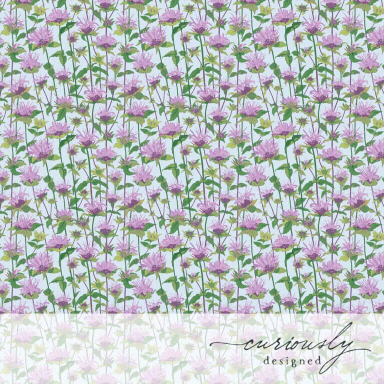
I LIKE: Botanicals. Flora. Fauna. Insects. Birds. Animals. Spiritual.
I DISLIKE: Unknown right now.
I LIKE: Silkscreen. Block printing. Risograph. Scratchboard. Gouache. Vector.
I DISLIKE: Watercolors.
I LIKE: Lots of pattern and texture. Shapes + lines more than outlined shapes. Flat shapes. Abstraction of forms and shapes. Use of negative space. Rhythm and movement defined using the shapes, lines and patterns. Expressive linework and use of color.
I DISLIKE: Unknown at this time.
I LIKE: Bold. Jewel tone. Vivid. Vibrant. A mix of saturated, muted & jewel tone colors. Vintage colors.
I DISLIKE: Pastels. A palette with all primary colors. A palette where all the colors are fully saturated.
I LIKE: Flat or awkward perspective. Simple perspective shown with just overlapping shapes.
I DISLIKE: 2 or 3 point realistic perspective.
My Artistic Heros
Below is what I see as a hugely eclectic mix of artists that I admire and follow, showing some of my favorite pieces of their work. I’ve created a Pinterest board with a few pieces of art from the following artists (in no particular order):

So now that I’ve done this (it took me almost a week to get through this exercise!) I can go through the next lessons on The Studio with some visual references. Also, as I go through the lessons and really study why I like these artists, I’m hoping I’ll be able to cull this list a bit. Unfortunately, I’ve only added to it in the last few days.