The next lesson in finding your artistic style (on Liz Kohler Brown’s “The Studio”) is about finding your color palette. It can be a set color palette that you use in all of your illustrations, or a way you like to combine colors. An example of the later would be, “muted colors with pops of black for contrast.”
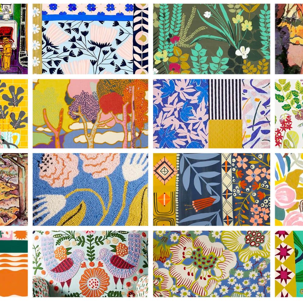
I thought I knew what “my colors” were. But apparently I was very wrong. The exercise in this lesson asked us to create a Pinterest board of artwork, fashion, interior design, etc. that we like and pin the images to a board. Then look at the group of images you’ve saved and try to work out if you see a pattern emerging.
Boy did I! And it was very unexpected, so much so that I went back changed some my pins on my “art heroes” Pinterest board.

I saw immediately that I am drawn to the color yellow ochre. This surprises me because it’s not a color I normally choose for my own art.
Before doing this exercise I tended to gravitate towards a lot of greens and blues that are saturated, but not overly so. But seeing my Pinterest board I can see that what I like is shades of color – antique and vintage looking, with a pop here and there of a bright pastel, neon or highly saturated color.
I’d almost describe the color schemes as “ugly.” But that’s harsh. Maybe unexpected is a better word. I found myself looking at artwork from the Fauvism art movement, and the work of Josef Frank. Who knew? But I’m going to sit with it a while and create some sketches and pieces in Procreate and Illustrator using some of these colors to see if I truly like them in my own art.